
Using Workspace Dashboard
What Dashboard Is For
Dashboard is your workspace-level control panel for execution quality, stability, and trend monitoring.
Use it to answer practical questions quickly:
- Is quality improving or degrading this week?
- Which pipelines fail the most?
- Which pipelines are unstable (flaky)?
- Are executions getting slower?
- What ran most recently and from which trigger source?
Read Dashboard from Top to Bottom
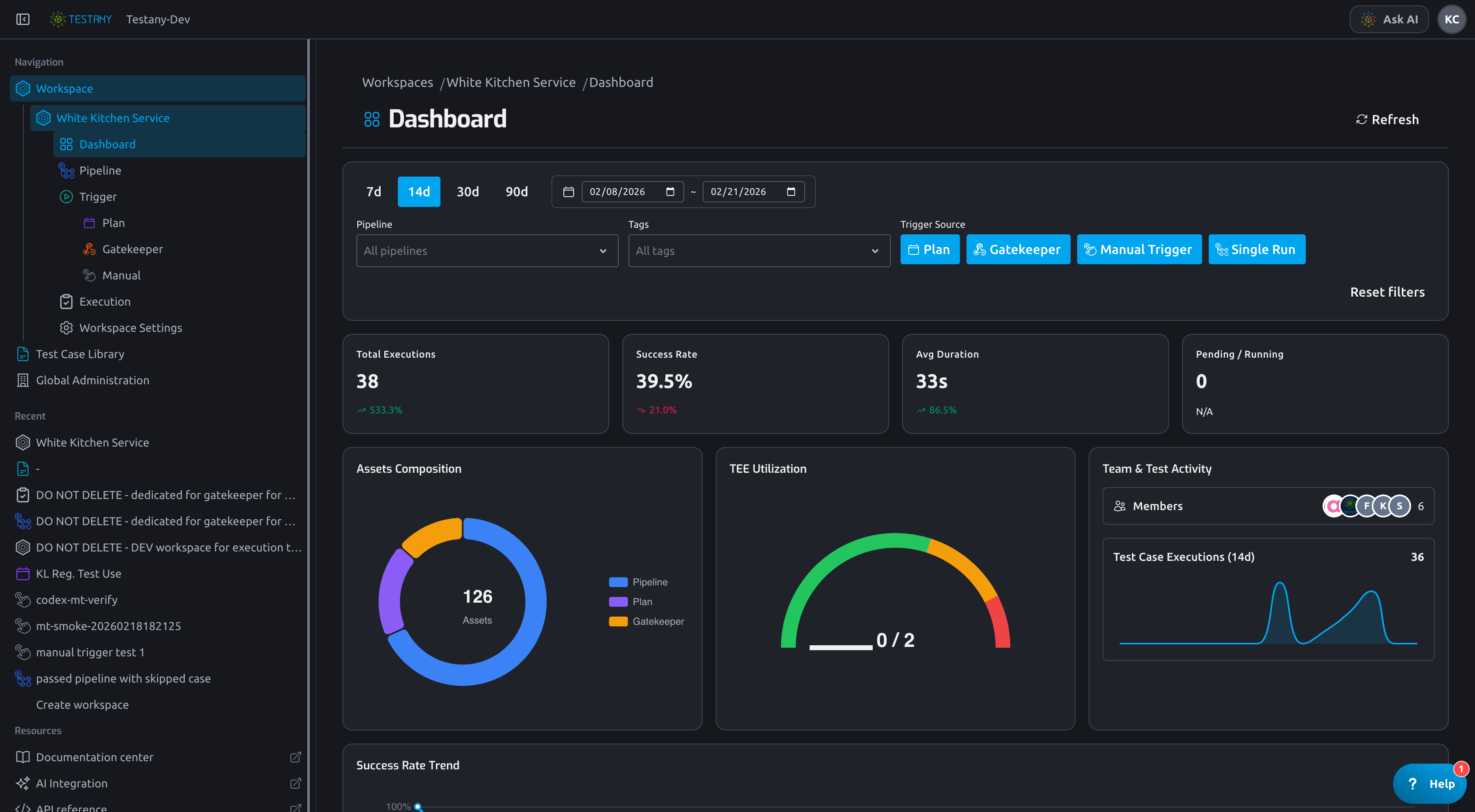
1. Filter Bar
Start here before reading any chart:
- Time range:
7d / 14d / 30d / 90dor custom date range - Pipeline: narrow to one or more pipelines
- Tags: narrow to tagged pipeline sets
- Trigger Source: filter by
Plan,Gatekeeper,Manual Trigger,Single Run
If data looks unexpected, first check whether old filters are still active. Use Reset filters to return to baseline.
2. KPI Cards
The first row summarizes the selected scope:
- Total Executions: total number of executions in current filters
- Success Rate: overall pass ratio in current filters
- Avg Duration: average execution duration
- Pending / Running: in-flight executions right now
Use KPI cards to detect anomalies first, then drill into detailed charts below.
3. Workspace Overview Panel
The overview panel gives fast context:
- Assets Composition: counts of pipelines, plans, gatekeepers, and test cases
- TEE Utilization: current TEE Utilization level
- Team & Test Activity: workspace member activity and recent test case execution volume
This helps distinguish quality problems from capacity/load problems.
Understand Core Analysis Sections
Which widgets are affected by filters
Dashboard has two data scopes: filtered analytics scope and workspace overview scope.
| Widget | Affected by time/pipeline/tags/source filters? | Notes |
|---|---|---|
| Total Executions | Yes | Uses current filter window and dimensions |
| Success Rate | Yes | Uses current filter window and dimensions |
| Avg Duration | Yes | Uses current filter window and dimensions |
| Pending / Running | No | Real-time queue/running load from executor status in workspace |
| Success Rate Trend | Yes | Filtered analytics scope |
| Execution Volume Trend | Yes | Filtered analytics scope |
| Pipeline Health Matrix | Yes | Filtered analytics scope |
| Top Failed Pipelines | Yes | Filtered analytics scope; only pipelines with enough runs are ranked |
| Top Flaky Pipelines | Yes | Filtered analytics scope; requires enough runs and compares pass/fail flips |
| Top Slowest Pipelines | Yes | Filtered analytics scope |
| Top Failed Test Cases | Yes | Filtered analytics scope |
| Recent Executions | Partially | Uses time + pipeline + source, but not tag filter |
| Assets Composition | No | Workspace-level asset inventory |
| TEE Utilization | No | Workspace-level executor capacity usage |
| Team & Test Activity (Members) | No | Workspace member snapshot |
| Team & Test Activity (Test Case Executions 14d) | No | Always fixed to recent 14 days in workspace timezone |
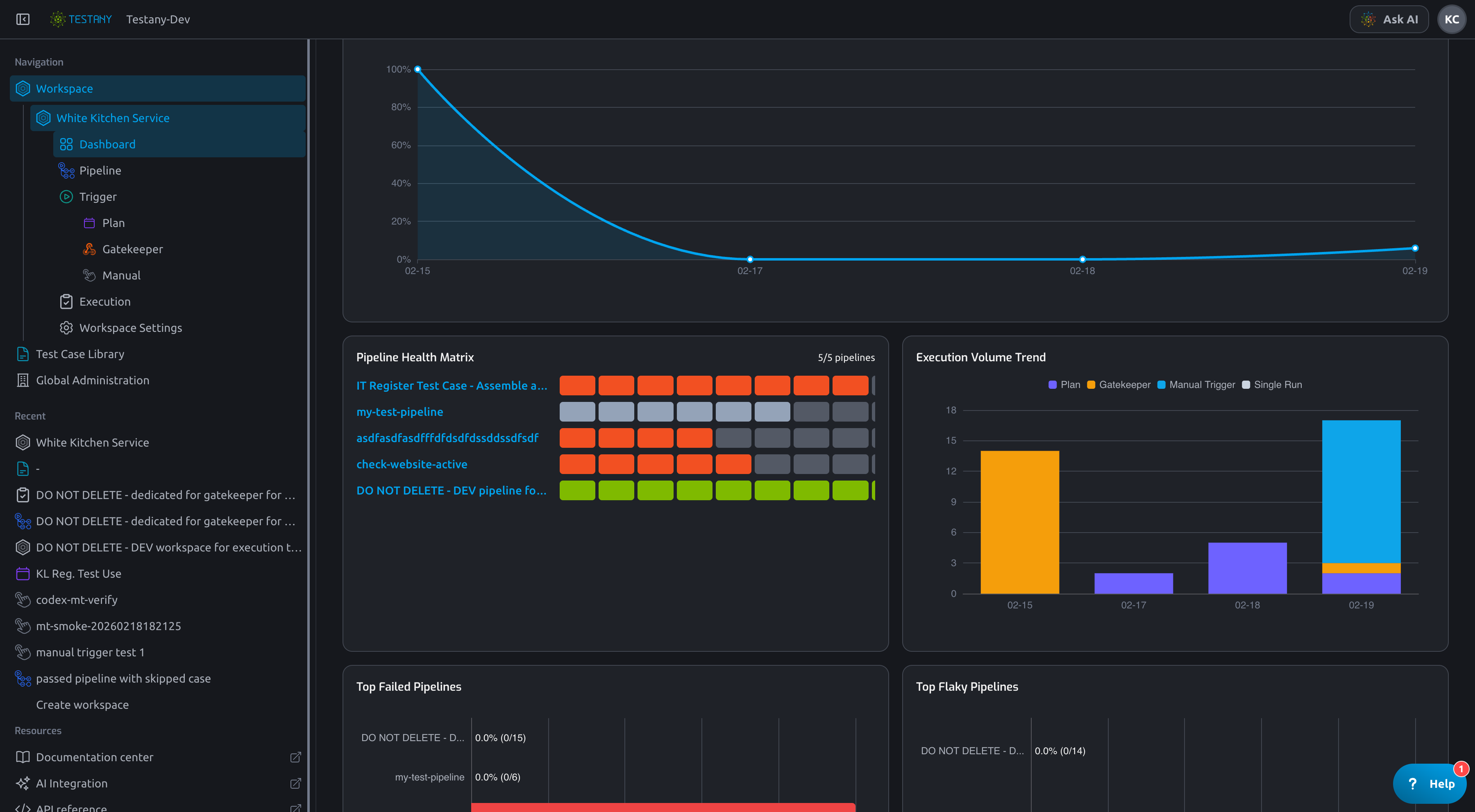
Success Rate Trend
Use this trend to see whether quality is consistently improving or dropping over time.
- A short dip may be a one-off incident.
- A sustained downward trend usually needs root-cause analysis.
Pipeline Health Matrix
Pipeline Health Matrix helps compare pipeline stability side by side.
- Rows represent pipelines.
- Cells represent recent execution outcomes.
- Click a cell/execution key to jump into execution investigation.
Top Failed Pipelines
Use this block to prioritize where failure impact is highest.
- Start with top-ranked pipelines.
- Correlate with failure trend and recent executions to identify fresh regressions.
- Ranking compares pipelines inside your current filter scope.
- Pipelines with very few executions are excluded to avoid noisy ranking.
Top Flaky Pipelines
Flaky Pipeline means outcomes are inconsistent across runs.
Use this block to find unstable pipelines that may pass sometimes and fail sometimes.
- Flaky ranking is calculated within your current filter scope.
- It focuses on pass/fail state changes across consecutive runs.
Top Slowest Pipelines
Use this block to find pipelines with high execution cost.
- Prioritize long-running pipelines with frequent usage.
- Check whether slow pipelines also overlap with failed/flaky pipelines.
Top Failed Test Cases
This table helps isolate recurrent failing test cases across pipelines.
- Failed = failed count
- Failure Rate = failed/total in current filters
Use Recent Executions for Fast Drill-Down
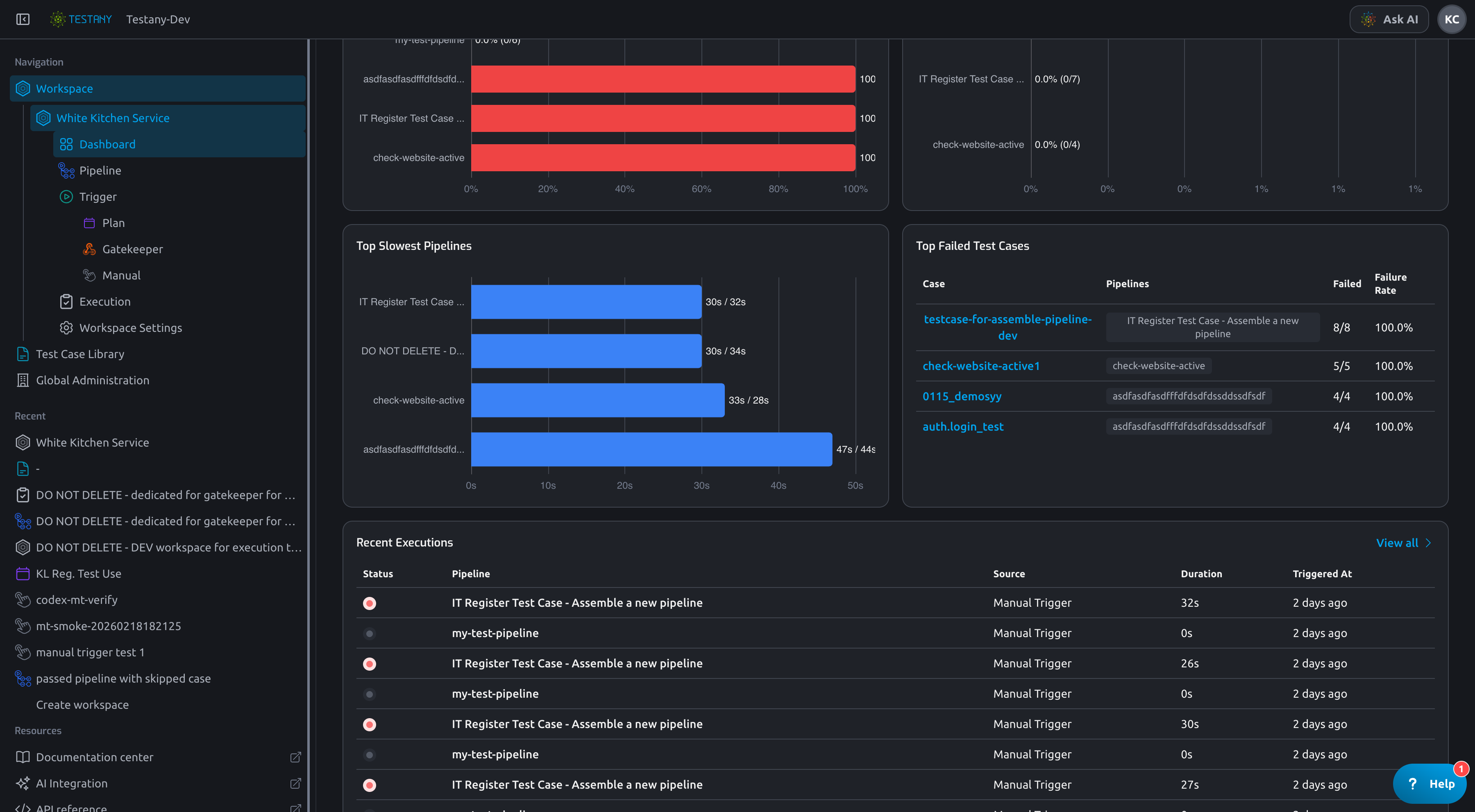
The Recent Executions table is your shortcut from trend to evidence.
Use it to quickly confirm:
- current status
- source (
Plan,Gatekeeper,Manual Trigger,Single Run) - duration
- trigger time
Then open execution detail for root-cause analysis.
Recommended Troubleshooting Workflow
- Narrow time range and source in filters.
- Check KPI cards for anomaly direction (quality, duration, or queue).
- Use matrix + top lists to locate candidate pipelines.
- Open recent execution details and verify failing test cases/logs.
- Confirm fix by refreshing dashboard and comparing trends.
Related Guides
Still have questions?
Our team is here to help. Get in touch and we'll get back to you as soon as possible.